
Role
Product Audit
Product Strategy
UX Design
Interaction Design
Tools
Figma
Notion
Photoshop
Crazy Egg
Timeline
3 days
The Problem
Business problem- High click volume but low lead conversion
User problem- Overuse and unclear use of CTAs

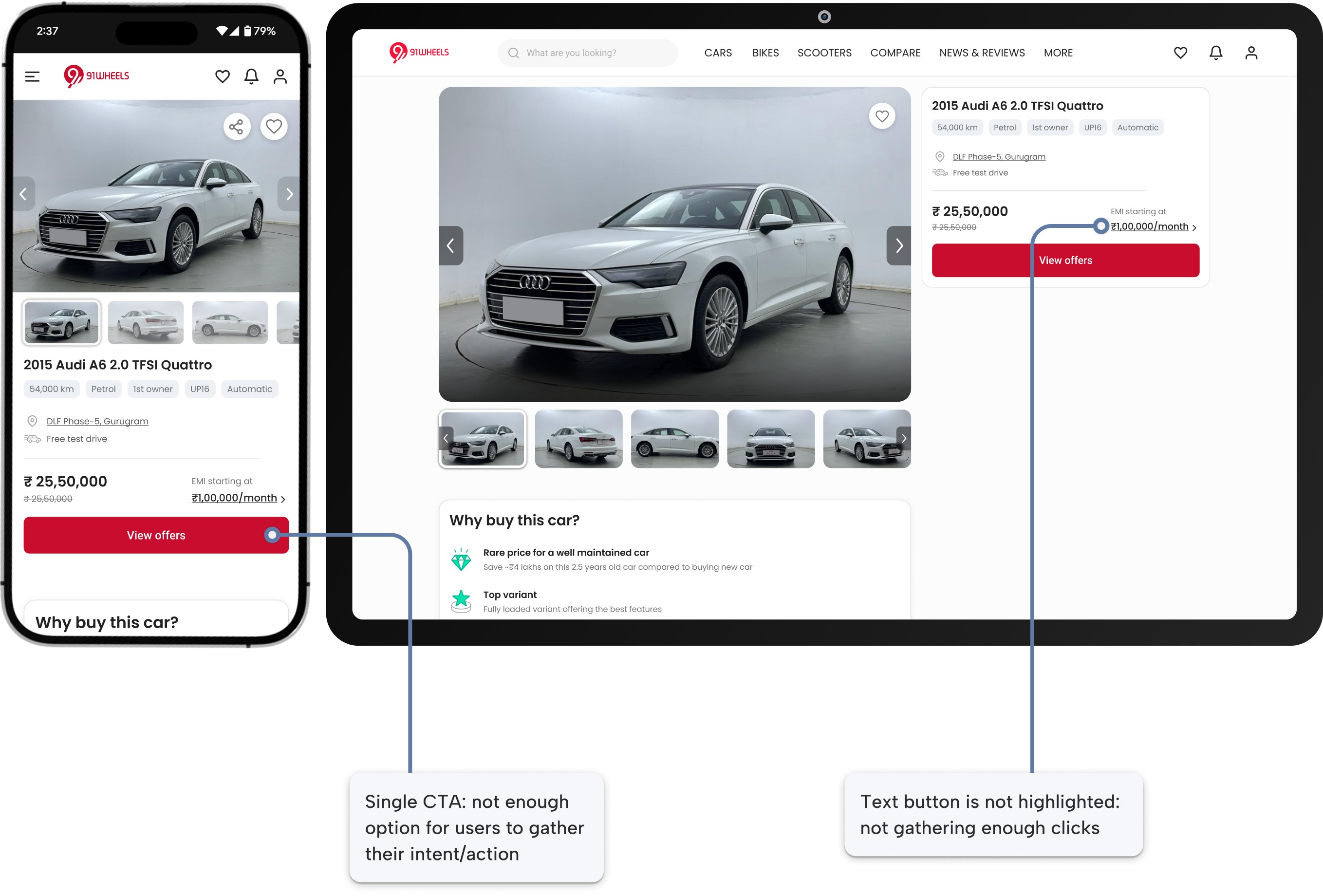
Usability Review & Research
I began the project with thorough research:
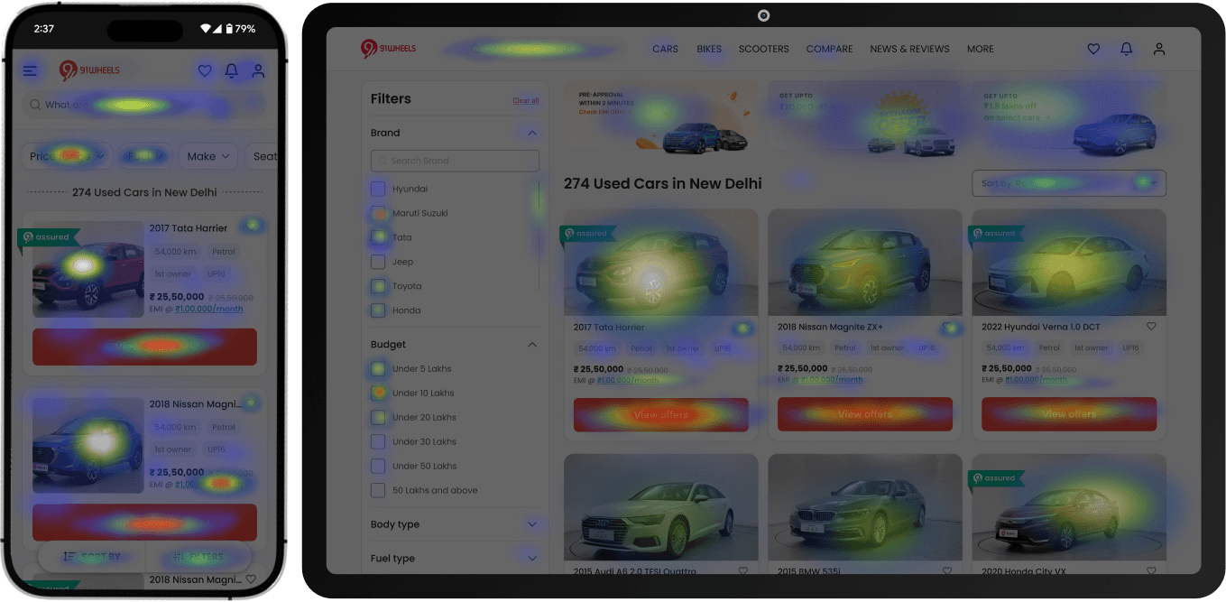
Listing page heat map

Detail page heat map
Heatmap Analysis:
Heatmaps revealed that 35% of clicks on the listing page were on car images, mistaken for buttons.
CTAs on the listing page were overused and lacked clear intent segmentation, leading to mis-clicks and drop-offs.
Data Insights:
Bounce rates from lead forms were 62% after users interacted with CTA from listing pages.
On detail pages, bounce rated from lead forms (generated from the primary CTA in the first fold) were 37%.
Users clicked on CTAs after using inspection report and EMI calculator and the drop off in such cases were just 22%.
Time spent on sections like inspection report and EMI calculator (both located in the Detail page) were much higher than any other section
Competitor Analysis:
Studied successful market leaders like CarDekho and Cars24 that emphasized lead prioritization through segmented actions like “Book Test Drive” and “Get EMI Details.”
The research confirmed the need to simplify the user interface, clarify actions, and most importantly, target and prioritize high-intent areas.
Ideation
Phase 1: Divergent exploration and rough prioritization
I began the ideation stage by generating a wide range of possible interventions across the used-car journey. Rather than committing to one direction too early, I first grouped these ideas into broad buckets such as quick alterations, time-consuming changes, likely roadblocks, and more radical overhauls. This gave me an initial sense of feasibility and potential value. At this stage, the goal was to iterate with an open mind, stay expansive, while applying a light layer of prioritization to identify the most promising paths forward.

Phase 2: Impact-Effort-Risk prioritization
Once the solution space was clearer, I moved to a more structured prioritization framework by mapping shortlisted ideas from Phase-1 on an Impact vs. Effort matrix and adding Risk as a third dimension (shown below).
This made the sorting phase more focused. Ideas with high impact, low to moderate effort, and lower risk were given a higher priority, while ideas with higher effort or higher risk were planned for later or deprioritized. This helped me choose solutions not just based on potential impact, but also on feasibility and the downside of failure.


Low risk

Medium risk

High risk
A:
Pop-up of lead form after 10 sec
B:
Remove CTAs from listing page
C:
Personalize CTAs for logged users
D:
Ask details on calculator
E:
Ask user details directly after landing
F:
Ask details for inspection report
G:
Add micro animation
H:
Add different type of CTAs for intent hierarchy
I:
Add priority labels for CTAs- backend
J:
Auto-fill forms for logged users
K:
Guide users to explore car details
This two-step ideation process helped me move from broad exploration to a focused, risk-aware implementation roadmap.
What can we add
Introduce different CTAs which a user with higher intent is likely to click.
Assign hierarchies to different CTAs in the backend (for sales teams to prioritize contacting the leads)
Add CTAs in higher intent areas like inspection report and EMI calculator
What can we improve
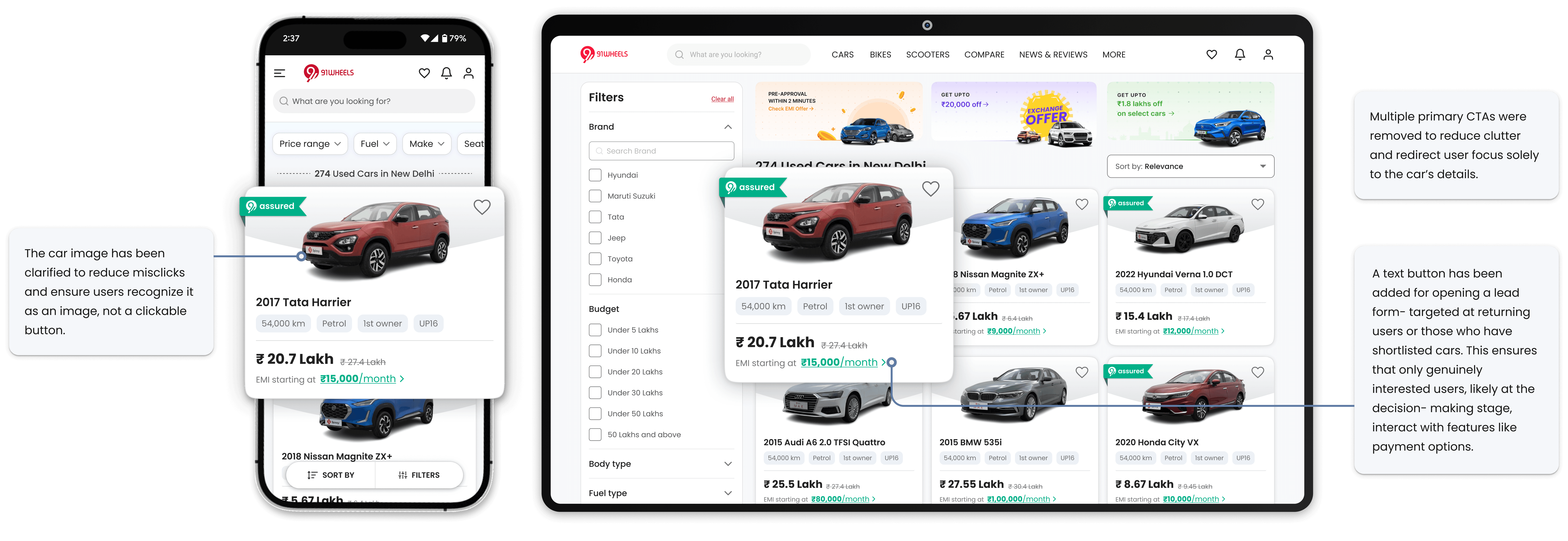
Remove the extensive use of buttons in the cards (in the listing page) to better assign click points
Improve images and clarity in cards
Low Fidelity Prototypes
I created a series of low-fidelity sketches to visualize and test the ideas quickly. These sketches acted as a foundation for understanding the flows and prioritizing the features that addressed the identified problems.

Key highlights from the prototypes include:
CTA Placement and Hierarchy: Sketches explored variations in CTA placement and visual hierarchy to reduce clutter and guide users toward high-priority actions. I also tried the implementation of various micro-interactions to guide attention accordingly.
Simplified Car Cards: Variations on card layouts included ideas like removing distracting backgrounds, centralizing car details, and highlighting specific actions like "Book Test Drive."
Introduction of CTAs in EMI and inspection report: I tried out various iterations of ways of guiding users to CTAs in high engagement areas like inspection report and EMI calculator.
These wireframes allowed us to test user expectations, ensuring that the final design was both user-friendly and effective in improving lead quality.
The Solution
Building on insights from the low-fidelity prototypes, we developed high-fidelity designs that incorporated user feedback and analytics. These polished prototypes were focused on delivering a seamless and intuitive experience while addressing the pain points identified earlier.


Outcomes and Impact
The redesign yielded measurable improvements:
Lead Quality: High-intent leads increased by 27.4%, reducing time spent on follow-ups with non-serious buyers.
Lead count: As a negative impact, lead count had dropped by almost 11%, but that was expected with the removal of CTAs from the listing page.
On the other hand, due to placement of CTAs (that open lead forms) in high intent areas, the following metric also had an improvement:
Drop off: The overall drop off from lead forms decreased by 20.1% (this data was analyzed 3 months after implementation).
Three key learnings
This project highlighted the importance of:
CTA Prioritization: Streamlining and segmenting call-to-action buttons reduced random CTA clicks and user confusion, guiding them toward relevant actions.
User Journey Optimization: Simplifying navigation by removing redundant elements and improving visual clarity ensured a seamless user experience, fostering deeper engagement and higher interaction with key features.
Leveraging User Intention: By understanding user behavior and capturing key moments of high engagement, strategic placement of key buttons and elements helped us achieve our goal.
Future scope
With more time and resources for iteration, the following improvements could further enhance user engagement and lead quality:
Compare Vehicles Feature: Adding a "Compare Vehicles" option would boost user engagement by allowing side-by-side car comparisons, while also capturing leads for multiple cars from a single interaction, increasing conversion potential.
Live Chat Support: Introducing live chat support would enable real-time assistance. Users would provide details before starting the chat, turning this interaction into a high-quality lead while improving customer trust and engagement.
Enhanced Payment and Financing Options: Building on the success of engaging users in high-intent areas, we could integrate in-depth finance options directly within the platform, or even partnering with finance parties for business growth. Offering these features would streamline the purchasing process, reduce friction for users, and increase the likelihood of converting engaged users into serious buyers.