
Client
Tools
Figjam
Figma
Photoshop
Google Analytics
AirTable
Wix
Timeline
4 months
My Role
As the Design Lead and a UX/UI Designer for the project, I was responsible for both strategic planning and hands-on execution. My contributions included:
Leading a cross-functional team of designers and researchers
Using Airtable to manage the project timeline, assign tasks, and track progress
Facilitating client reviews and incorporating feedback into the design direction
Maintaining the design system and ensuring consistency across components
Designing key screens and flows with a strong UX focus
Conducting usability tests and synthesizing findings to inform iterations

The Problem
Business problem-
1. The site lacked a cohesive visual identity, reducing brand recognition
2. High bounce rates and low conversions
User problem-
1. Unclear navigation throughout the website.
2. Fragmented Experience: Some pages have incomplete information on their
dedicated page
Initial Website Layout and Usability

Home page (first fold)
Volunteer opportunities dominates here, misaligning with business goals. The primary revenue stream, Membership is visually deprioritized.
Lack of branding, especially for a user who lands here for the first time.
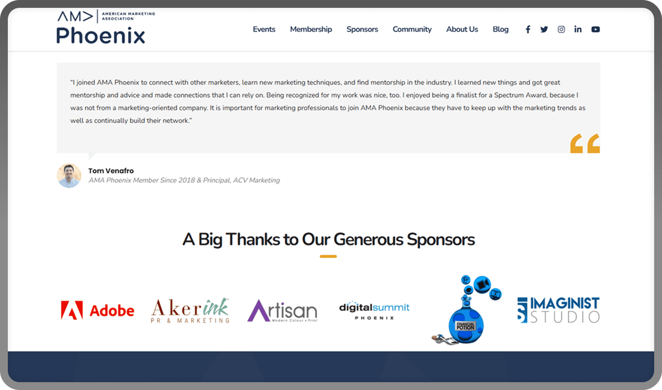
Home page (fourth fold)
Trust-building elements like testimonials are placed too low on the page
Users may exit before encountering social proof or credibility indicators

Volunteer page
Poor color hierarchy: secondary colors used in headers, and disabled-style colors applied to active elements
No clear CTA to take any action for the process of applying

Membership page
Text-heavy layout reduces visual clarity, interest and engagement
Multiple membership categories are hidden and only revealed after clicking the CTA, making it harder for users to compare options upfront
UX Research
To ground our redesign in real user needs, we conducted foundational UX research. This included reviewing analytics data, creating personas, and mapping user journeys to identify friction points in key flows.
Device Behavior (Google Analytics)
Google Analytics revealed that 98% of users accessed the site via desktop, reinforcing our decision to prioritize a desktop-first design approach.
High bounce rates were observed on the homepage and membership pages, suggesting usability or content issues in those areas.
Personas
Based on stakeholder insights and behavioral patterns, we developed multiple personas, whose insights helped us focus on real user needs and expectations, guiding decisions around content structure, features and overall usability. Two of the personas are shown below:

Persona 1: The Emerging Marketer- A student or early-career professional seeking networking and learning opportunities.

Persona 2: The Mid-Level Professional- A working marketer evaluating the value of membership and events before committing.
User Journey Maps
To better understand how users interact with the AMA site, we created detailed user journey maps. These helped us identify pain points, emotional touchpoints, and moments of opportunity, from landing on the site to signing up for events for exploring membership options. This exercise helped shape our navigation, layout and content decisions, ensuring a smoother and more intentional user flow throughout the site.

What can we improve
Reprioritize membership- the main source of revenue
Elevate trust-building elements
Clarify Visual Hierarchy
Reduce content overload
Simplify Navigation
What can we add
Sticky CTA bar or button
Event filter or sort feature
Success metrics or social proof stats
Real member spotlights or stories
Information Architecture and Sitemap
To ensure intuitive navigation and improve content discoverability, we restructured the website’s information architecture. Key actions included:
Conducting a content audit to evaluate existing pages and eliminate redundancies
Iterating through multiple sitemapping versions, progressively refining based on internal feedback and user needs
Using progressive disclosure to show information only when relevant, minimizing cognitive overload
This reorganization allowed us to reduce task failure rates and significantly improve user engagement. By aligning the structure with key user intents- whether becoming a member, volunteering, or attending events- we created a clearer, more accessible experience for all users.
Current Navigation (Before):
Confusing structure with mixed priorities, broken links, and unclear groupings. It has pages of different hierarchies that can be accessed at the same level.

Final Structure:
We explored several layout strategies to test content groupings, external/internal links, and how deep the hierarchy needed to be. We finalized a site map grouped by core user goals: Events, Membership, Career, Resources, Blog and About Us.

This new structure allowed users to locate key information faster- whether they wanted to join as a member, attend events, or apply as a volunteer- while also boosting clarity for first-time users.
Lets talk visuals
To align the visual design with AMA Phoenix’s identity, we presented four distinct visual themes to the client:
Bento Grid – modular and content-dense
Arizona Theme – inspired by local tones and textures
White (open)-Spaced Layout – minimal with large white space
3D Layering – depth-driven with stacked cards and layering

The client chose 3D Layering, as it brought a sense of structure, professionalism, and modernity while supporting content hierarchy effectively.
Low Fidelity Prototypes
Once the visual direction was locked, we created low-fidelity sketches to quickly define layout structure, content priority, and navigation flows. These wireframes helped validate the page-level experience before investing time in detailed visual design.

The Design System
We developed a custom design system grounded in AMA Phoenix’s brand guidelines to ensure visual consistency, scalability, and efficiency across the redesign.
The system unified typography, color palette, components, spacing, and interaction patterns, creating a shared language for both design and development. It not only improved collaboration within the team but also laid a strong foundation for future updates and content expansion.
This system wasn’t just about maintaining visual harmony—it was about building a flexible structure that could evolve with AMA’s needs and support long-term growth.

High Fidelity Screens
After refining our structure and visual direction, we translated the experience into polished, high-fidelity pages, focused on the highest-traffic and highest-impact areas of the site. Each screen was designed with clarity, actionability, and brand consistency in mind.
Home
We designed the homepage using the 3D layering visual style selected by the client. We focused on guiding users toward high-priority actions like joining AMA—while building trust from the very first scroll.
We crafted a hero section with strong branding and supporting statistics to establish credibility quickly. As users scroll, we introduced key content sections including career resources, upcoming events, testimonials, membership benefits, sponsor highlights, and more. We ensured each section delivered clear value and supported user goals, ultimately trying to reduce bounce rates and boost engagement.

Membership
We designed the first fold to clearly present membership options, pricing, and benefits, highlighting the one that profits the business the most. It highlights AMA's value through interactive features, showcasing perks like webinars, marketing toolkits, and networking opportunities. The "Convince Your Boss" section offers a compelling case, with a downloadable pitch deck to streamline approval.

Events
We designed the Events page as a central hub for all AMA events, with a focus on the Spectrum Awards. The Hero section features a live countdown to build anticipation, while the Speakers section highlights key figures and invites future speakers. The Upcoming Events section on the Events listing page provides a quick overview, allowing users to explore details or view all events easily.

Blog
The blog section was transformed into a content-rich, scroll-friendly space that follows SEO guidelines. A clean three-column grid presents posts visually, with added tags and read-time indicators. Category filters let users sort by interest, creating a more personalized reading experience that supports thought leadership.

About Us
We humanized AMA by spotlighting its leadership through photos and short bios. The mission and vision are now framed with clean blocks and accessible language. Finally, the contact form in the “Connect With Us” section makes reaching out simple and friction-free.

Usability Testing
To validate the effectiveness of our redesign, we conducted moderated usability testing with 5 participants using a structured, scenario-based protocol. Users were asked to think aloud during the process.
We tested the prototype across three core flows:
Exploring the homepage and initial impressions
Navigating and understanding the Membership page
Registering for an event from the Events page
Key Findings
“Things are where I expect them to be, feels easy to find the info.”
“The site feels trustworthy. I’d consider joining events.”
Users described the site as 'professional', 'bold' and 'easy to navigate'
Navigation was intuitive: All 5 participants found their way around easily, using both the navbar and in-page links
Event discovery and registration were smooth: Every user successfully located the event and attempted to register without confusion
Homepage made a strong impression: Users appreciated the clarity, layout, and trust-building elements
Content structure worked well: Accordion sections, layout hierarchy, and supporting visuals improved understanding
The “Convince Your Boss” section stood out: Mentioned by 3 of 5 users as helpful and persuasive
Areas for Improvement
Some CTAs lacked urgency: Users missed certain actions during the test; CTA hierarchy needed to be more visually assertive
Some visual elements were distracting: Background patterns and gradients created mild visual noise for 2 participants
Layout adjustments needed: Minor spacing issues and content stacking could be optimized for better readability
Potential Impact
This redesign gives AMA Phoenix a scalable, brand-aligned digital presence that reflects its professional mission and community value. By simplifying navigation, surfacing trust signals earlier, and improving CTAs, the new site is positioned to:
Increase membership sign-ups through clearer value communication
Boost event registration and attendance via streamlined discovery
Strengthen brand credibility with first-time and returning users
Reduce bounce rates and increase user engagement across key pages
Key Learnings
I learned the importance of brand identity not just as a visual system, but as a tool for building trust and emotional connection. Every design decision was an opportunity to reflect AMA Phoenix’s values of professionalism, credibility, and community.
As the design lead, I developed a deeper understanding of what it means to guide a team, managing timelines, giving direction, and empowering others.
I gained experience translating qualitative research into structured design improvements, and saw firsthand how subtle UX shifts can dramatically impact user confidence and conversion.
Building and maintaining a modular design system taught me how to create sustainable frameworks that improve collaboration and scale smoothly with future content.
Future Scope
If given more time or resources, here’s what we’d explore next:
Conduct long-term analytics tracking to measure post-launch performance
Add an onboarding flow or first-time user guide for new members
Conduct A/B testing for CTAs, layout variants, and content strategies