
Client
Mayo Clinic
Tools
Figma
Figjam
Notion
Timeline
2 months
My Role
I led the research and design for the platform, from understanding user workflows to shaping the final product experience.
User Research: Studied workflows across admins, data extractors, and reviewers
Stakeholder Collaboration: Facilitated co-creation and validation sessions with Mayo Clinic SMEs
Information Architecture: Defined a workflow to structure the platform experience
AI Strategy: Framed the Human-in-the-Loop approach for AI-assisted review
Product Design: Designed six core workflows end-to-end
Design System: Maintained scalable components and patterns across the entire product platform
The Problem

Business Problem
Living Systematic Reviews are meant to be living- updated continuously as new evidence emerges. But the data extraction phase, where reviewers pull structured data points from clinical trial PDFs, had become the bottleneck. One paper took roughly a week per reviewer to complete. Multiply that by the dual-independent-reviewer standard, and a single update cycle could stretch for months.
User Problem
Reviewers were running a clinical research process on a tool that wasn't built for it. The result: scattered tools, dual-screen dependencies, manual context-switching between PDFs and forms, and no way to trace where a piece of data came from once it landed in a spreadsheet.
The Bigger Context
Behind both of these sits the 17-year evidence-practice gap- the average time it takes for a validated research finding to reach patient care (Hodder et al., 2024). Anything that speeds up evidence synthesis has a direct downstream effect on patient outcomes. This wasn't a productivity tool. It was infrastructure for translating research into treatment.
Understanding the Existing System
Before designing anything, I needed to understand exactly where the friction lived. Because this was an in-house product, I had direct access to the actual users, something rare in healthcare design, which let me ground the research in real workflows instead of secondhand assumptions.

Table creation (User- Admin)

Data Extraction (User- Data extractor)

LLM Prompt Creation (User- Data extractor)
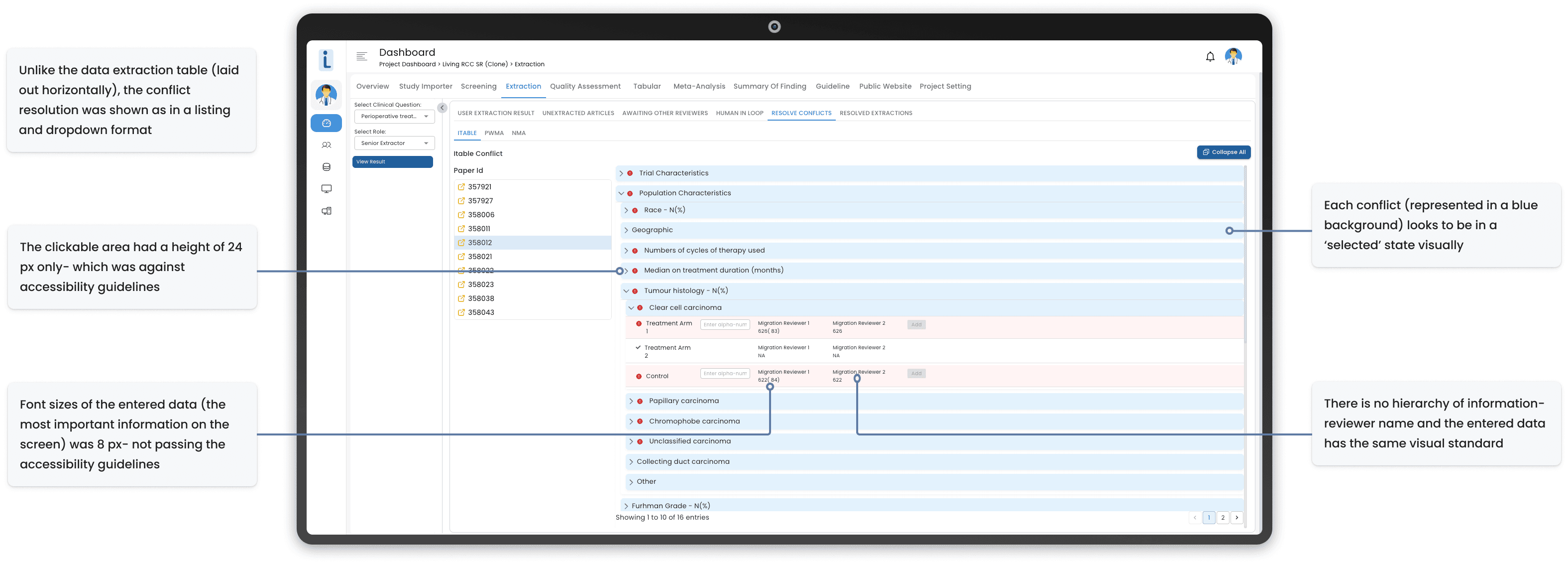
Conflict Resolution (User- Senior Reviewer)
Major pain points identified in the existing platform
Dual-screen dependency
Reviewers physically needed two monitors- one for the PDF, one for the extraction form. Anyone working remotely or on a laptop was effectively locked out.
No embedded PDF viewer
The trial paper lived in one tool; the extraction form lived in another. Every data point required a context switch.No source traceability
Once a number was typed into a field, there was no way to know where in the 40-page PDF it came from. When two reviewers disagreed, resolving the conflict meant re-reading the entire paper.Scattered navigation
Templates, assignments, extraction, and conflict resolution lived across disconnected screens. Reviewers described it as "five tools pretending to be one."Weak audit trail
Living reviews evolve- values change as new evidence comes in. The existing tool didn't preserve why and when a number changed, only that it had.Lack of templates (table creation and prompt writing)
Admins had to repeatedly create the similar tables for different data extractions; while data extractors wrote the same prompts multiple times for different LLM extraction.Law of similarity
For the same user and the same data, the information was sometimes shown in a vertical layout, while at times it was in a horizontal format.Accessibility flaws
There were multiple instances where font sizes, contrast ratios and clickable areas did not meet the accessibility requirements.
UX Research
I structured research around three distinct user roles, each with a fundamentally different relationship to the product:
Role
What they do
What they care about
Admin/ Project Manager
Creates extraction templates, assigns reviewers and AI agents to papers
Speed of setup, workload visibility, control over validation rules
Data Extractor
Reads clinical trial PDFs and extracts structured data points
Cognitive load, screen real estate, accuracy
Senior Reviewer
Resolves conflicts between two independent extractions
Source traceability, audit trail, ability to override AI
Research Methods
Because this was an in-house product with direct user access, I leaned hard into qualitative methods- the goal wasn't statistical significance, it was understanding the texture of the work.

Competitive landscape
The systematic review software space is dominated by tools like Covidence and DistillerSR, which are built as general-purpose platforms serving thousands of research teams. They're robust for screening and de-duplication, but the data extraction experience is form-heavy, lacks deep AI integration, and isn't optimized for the living (continuously updating) variant of systematic reviews.
Mayo's library actually uses Covidence for their general systematic reviews, but the Living Evidence team needed something specifically tuned to their longitudinal, AI-assisted workflow. That's the niche this product was built to fill.
Key insights from research
Three themes surfaced across every interview, regardless of role:

What we need to solve for
Synthesizing research into design directives:
What we can improve:
Eliminate the dual-screen dependency by embedding the PDF natively
Establish explicit data-to-source linkage for every extracted field
Consolidate scattered screens into a unified, role-aware workflow
Preserve change history so reviewers can see how a data point evolved
Reduce template setup time so project managers can move independently
What we can add:
Native LLM integration with full transparency (no black-box outputs)
Support for multiple linked documents per trial (primary + supplementary)
Workload visibility for fair task allocation
An "early complete" path for studies where some fields are genuinely inapplicable
A conflict resolution interface that mirrors the extraction interface, to minimize learning curve
Ideation
Research told me what was broken. Ideation was about figuring out what to build in its place- and I worked through it in three deliberate passes, each one tightening the thinking from the one before.
Phase 1 - Sketching divergent directions

I started on paper. No fidelity, no commitment- just rapid sketches exploring fundamentally different ways to structure the workflow. The goal at this stage wasn't to find the answer; it was to map the range of possible answers so I could see which trade-offs actually mattered.
Three directions kept surfacing across the sketches:
A step-by-step linear flow that guides reviewers through one task at a time
A multi-panel dashboard that lets reviewers see everything at once, Excel-style
A trial-centric timeline organized around the longitudinal life of a clinical trial
Phase 2 - Translating sketches into structured wireframes

Once I had the three directions, I built them out as structured wireframes- enough fidelity to walk stakeholders through, but stripped of visual design so the conversation stayed focused on logic and layout instead of color and typography.
Putting them in front of Mayo's SMEs surfaced clear reactions:
The linear flow felt too restrictive. Expert reviewers need to jump back and forth constantly, and a forced progression got in the way.
The dashboard mapped immediately to the Excel-based mental model reviewers already had. They understood it without explanation.
The timeline view was intuitive for big longitudinal trials but felt heavy for smaller reviews- too much UI for too little payoff.
Phase 3 - Annotated refinement

The third pass was where the synthesis happened. I went back into the strongest concept (the dashboard) and started layering in specific behaviors from the other two- collapsible sections, resizable panes, embedded PDF references, export controls, drag-and-drop reordering. The yellow annotations capture the design decisions in flight: not just what the screen does, but why each element earns its place.
The takeaway from all three passes wasn't "pick one concept." It was that no single concept on its own would work- reviewers needed the clarity of the linear flow, the flexibility of the dashboard, and the contextual awareness of the trial-centric view. That synthesis became the foundation of the final design.
Design System
A custom design system anchored the platform, built specifically for high-cognitive-load clinical work where reviewers spend 6+ hour sessions in the tool.

Color: A blue-anchored palette chosen for its associations with trust and focus in research contexts. All combinations meet WCAG 2.1 AA contrast standards.
Typography: Inter with line heights tuned per Google Material guidance, calibrated to reduce visual fatigue during long extraction sessions.
Spacing: 8-point grid system for consistent rhythm.
Components: Standardized buttons, form elements, and navigation patterns, all designed with keyboard navigation and screen reader compatibility from the start.
The system was modular by design so the Mayo engineering team could extend it without breaking visual consistency post-launch.
The Solution
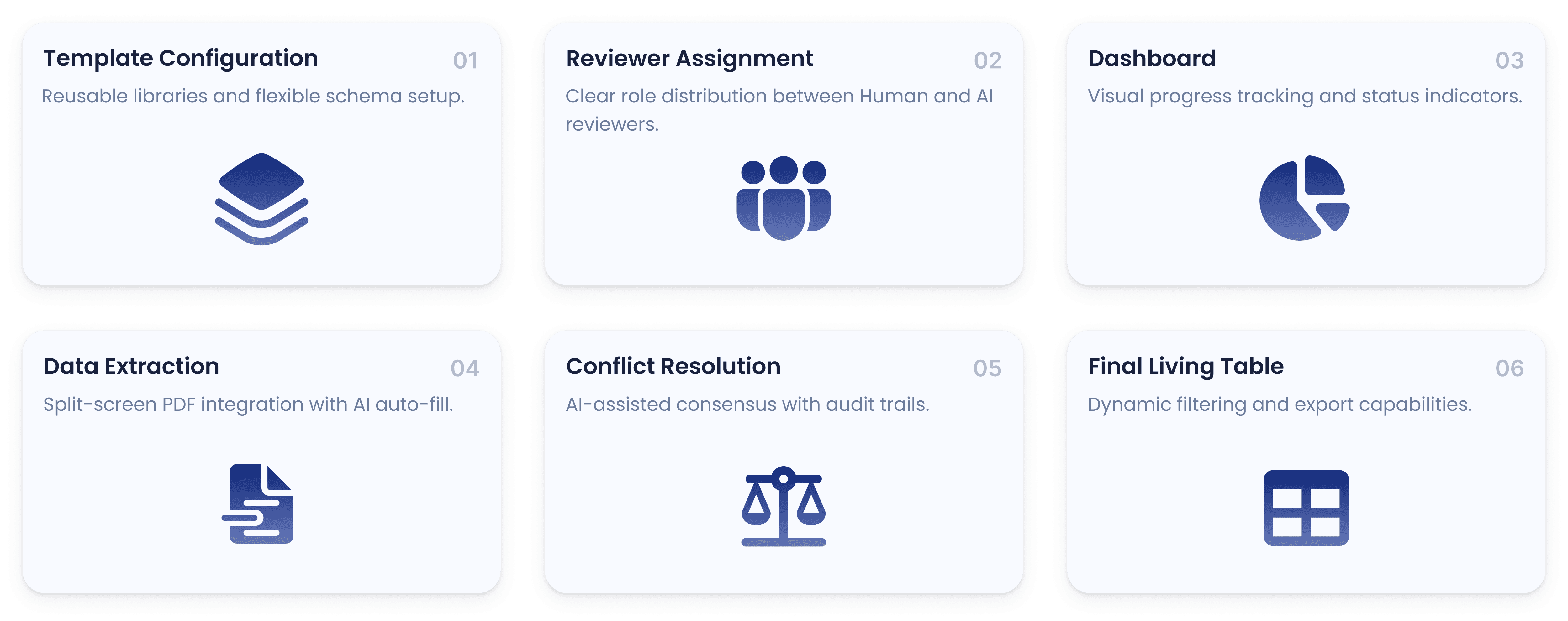
The platform addresses six workflow stages, each mapped to a specific user role and stage in the living systematic review.
Flow 1 - Creating Extraction Templates (Admin)
The platform addresses four workflow stages, each mapped to a specific user role and pain point.

The admin's first job is defining what to extract- building a template of fields, headings, and validation rules. In the existing tool, this required engineering help. In the redesign, admins can do it independently.
A library of reusable templates on the left, plus a macro library of commonly-extracted parameters on the right, lets admins assemble a new template in minutes instead of hours.
Parameters are organized into tabbed categories (Trial Characteristics, Population, Outcomes)- the same structure extractors will see, so there's zero mismatch between admin intent and extractor experience.
Granular controls: validation rules (text-only, alphabetical-only), nested sub-parameters, and the ability to save any configuration as a new reusable template.
Why it matters: Project managers can now spin up a new Living Systematic Review independently, removing engineering as a gatekeeper.
Flow 2 - Assigning Reviewers (Admin)

Once a template exists, the admin assigns it to extractors. This screen formalizes a structural decision that didn't exist before: the choice of human-AI teaming model.
The system supports three extraction modalities: human-human (the current standard), human-LLM, or LLM-LLM. Admins pick the model based on review requirements and resource constraints.
A live workload indicator on each human reviewer prevents bottlenecks from uneven allocation- something the old tool had no visibility into.
Why it matters: This isn't just an assignment screen, it's where the team formally encodes how much AI involvement a given review will have. That decision has real implications for downstream verification, and we made it explicit instead of accidental.
Flow 3 - The Extraction Dashboard (Data Extractor)

The extractor's home base. Every assigned study, with metadata, status (To Do / In Progress / Early Complete / Completed), progress percentage, and a context sensitive action button. It has sortable columns support different work patterns- some reviewers batch by trial, others by journal, others by deadline.

A drawer filter lets reviewers filter their assignments by status, PMID, trial name, or journal.
Why it matters: Before this, extractors had no consolidated view of their own work. They tracked it in side-spreadsheets. The dashboard turned that into a first-class part of the product.
Flow 4 - The Extraction Dashboard (Data Extractor)
This is the heart of the tool- where most of the time is spent, and where most of the impact comes from. It's also where the biggest single change happened: the PDF lives inside the workspace.

The interface is a two-panel layout (PDF on the left, extraction form on the right) with an optional third utility panel. No more dual monitors. No more Alt-Tab. The form uses an accordion structure so extractors can collapse completed sections and focus on what's left.
Mark Source - establishing data-to-evidence linkage
This is the feature that unlocked everything else. The Mark Source mechanism creates an explicit, persistent link between every extracted data point and the exact location in the PDF it came from.

Three ways to populate a field, all of which create the same backend link:
Type the data manually, then click "Mark Source" and highlight the corresponding text in the PDF.
Click "Mark Source" first, then highlight the PDF text- the field auto-populates.
Highlight text in the PDF directly; a "Click to Populate" button appears, letting you assign it to a specific field.
The form uses color-coded completion states (red = empty, yellow = partial, and green = complete) so reviewers always know where they are.
Why this matters more than any other feature:
This single change is what made source verification instantaneous instead of a re-read. When we measured the impact after launch, this is the feature that drove the 80% reduction in conflict resolution time.
Utility Panel: Markdown, JSON, and AI Chat
The third panel, also called the 'Utility Panel' can be opened up on click of the 'arrow' button and features 2 models of parsed information: Markdown and JSON; and an integrated LLM chat feature (shown below)

The utility panel turns the parsed paper into something interactive. Three modes:
Markdown- a parsed, scrollable version of the paper. Selecting text here auto-scrolls the PDF to that location, creating bidirectional navigation.
JSON- a structured representation of the paper for programmatic workflows or integrations.
Chat- an AI assistant grounded in the paper, with every response traceable back to the PDF via "View Source."
LLM Prompt Builder - making AI usable, not magical
Generic AI chat is too unstructured for in-depth and repeated clinical data extraction. The Prompt Builder gives reviewers a structured, template-based way to query the LLM, as shown below:

The LLM prompt builder contains the following:
A library of pre-built prompt templates on the left (Trial Overview, Population Summary, Outcomes Table, etc.)
A parameter selector on the right- reviewers tick which fields they want extracted with the desired prompt
A live-updating and editable prompt preview in the middle
Following the same, the LLM extracted results land in the Chat panel with checkboxes next to each value. Reviewers can select all (or some) and bulk-populate the form via "Populate Answer." Every populated value carries a "View Source" link back to the PDF. The results are not auto-populated as each extracted data should be verified by the human to maintain accountability.

This is the design philosophy in one feature: AI as a productivity layer, not an oracle. Every output is checkable. Every value is yours to accept or reject.
Early Complete - building in real-world flexibility
Dr. Ali surfaced this during research: sometimes a study genuinely doesn't have certain data points, and reviewers were leaving fields blank with no way to mark "this is intentional, not incomplete."

This feature, activated on clicking the ‘Finish’ button, allows them to finalize a study at their discretion, even if some fields remain unfilled. To ensure accountability and maintain data integrity, the interface provides a visual warning highlighting incomplete fields, and reviewers are required to provide a written justification before marking a study as complete. This ensures that the decision to complete early is intentional and documented, balancing efficiency with responsibility.
Flow 5- Conflict Resolution (Senior Reviewer)
When two extractors disagree on a value, a senior reviewer resolves it. This used to be the most painful part of the entire process- manually re-reading papers to figure out who was right.

The conflict resolution interface deliberately mirrors the extraction interface- same layout, same PDF viewer on the left, same accordion structure on the right. Zero new mental model.
For each conflict:
Both reviewer entries are shown side-by-side, each with a "View Source" link that jumps directly to the marked location in the PDF.
The senior reviewer can pick one, edit either, or enter entirely new data.
Color-coded status (red = unresolved, green = resolved) plus a toggle to hide already-resolved items keeps the view focused.
LLM-assisted conflict resolution

For batch resolution, the senior reviewer can invoke LLM-assisted resolution- same prompt-builder pattern as extraction, but tuned for common conflict types (numerical discrepancies, treatment-arm reconciliation, outcome label standardization).
The LLM-resolved conflicts are also marked with a purple tag and explicitly do not auto-populate the final table- a human reviewer must still verify them. This preserves the human-in-the-loop guarantee even when AI handles the heavy lifting.
Flow 6 - The Living Table (Accessible by all Roles)
The final extracted data isn't a static export. It's an interactive, living table that becomes the team's working repository.

The living table contains:
Filters at the top let users hide rows/columns.
A toggle highlights cells that went through conflict resolution.
Export to Excel and CSV for downstream statistical analysis.
Clicking any cell opens a drawer with two tabs: Details (full context for the parameter) and History (as shown below).

The History tab is what makes this a living review. Every change to a parameter is logged chronologically- timestamp, who edited it, whether there was a conflict, and a "View Source" link to the PDF location for that specific version of the value.
For Living Systematic Reviews, where evidence evolves over years as new trials publish, this audit trail isn't a nice-to-have. It's the difference between a tool that updates and a tool that remembers.
Outcomes and Impact
The platform went live on April 27, 2026 and has been in production use by Mayo Clinic's Living Evidence team since.
Validated post-launch impact:
Extraction time per paper dropped from ~1 week to ~2 days per reviewer- a roughly 70% reduction in time-to-complete.
Conflict resolution time reduced by 80%, driven primarily by the Mark Source feature making verification instantaneous instead of requiring a full re-read.
Eliminated dual-monitor dependency- reviewers can now work from any setup, including laptops.
AI adoption increased without trust erosion- because every AI output is checkable and human-verified, reviewers are using LLM-assisted features regularly rather than avoiding them.
The downstream implication matters more than the numbers. Every week saved on a single extraction compounds across hundreds of trials, across multiple living reviews, across years of continuous updates. Faster evidence synthesis means clinical guidelines update faster, which means treatments reach patients faster.
Key Learnings
1.
Trust is a design problem, not a model problem
The team's hesitation around AI wasn't about model accuracy- it was about verifiability. Every AI feature in the final design was built around making outputs checkable in one click. That was what unlocked adoption.
2.
In-house products let you skip the assumptions step
Having direct access to Mayo's three user groups meant I could test ideas in real workflows, not in proxy personas. Every major design decision- multi-document support, Early Complete, the prompt builder structure- came from a specific reviewer telling me about a specific moment of friction.
3.
Mirroring existing mental models is a feature, not a compromise
The conflict resolution UI deliberately mirrors the extraction UI. The data table looks like Excel. These weren't shortcuts- they were deliberate choices to make the tool feel familiar to people who'd been working a specific way for years.
4.
Designing for a "living" product changes everything
A typical extraction tool can treat data as a snapshot. A living review tool has to treat data as a stream- preserving history, surfacing change, and making evolution legible. That requirement reshaped the audit trail, the conflict resolution flow, and the final table.
Future scope
With the platform now in production, the next phases will explore:
Predictive conflict identification- flagging likely-conflict fields before extraction is complete, so reviewers can address them proactively.
Reference manager integrations- direct connections to EndNote and Zotero to streamline trial ingestion.
Expanded LLM capabilities- fine-tuning the in-tool models on Mayo's specific extraction patterns to improve first-pass accuracy.
Cross-review intelligence- surfacing patterns across multiple living reviews to inform clinical guideline updates faster.