
Role
Tools
Figjam
Figma
Photoshop
Timeline
3 months
The Problem
Business problem-
1. Outdated design
2. Manual tournament registration caused drop-offs3. Unclear structure and scattered information
4. Lacks information about the golf course and club
User problem-
1. Website lacked structure and clarity leading to lots of confusion
2. 83% of users (during testing) found the visual design unappealing
Initial Website Layout and Usability

Home page
The design does not make it feel like a landing page of a website; lacks orientation cues
Lots of wasted screen space and oversized fonts
Overcrowded top navigation with unclear hierarchy creates friction and decision fatigue
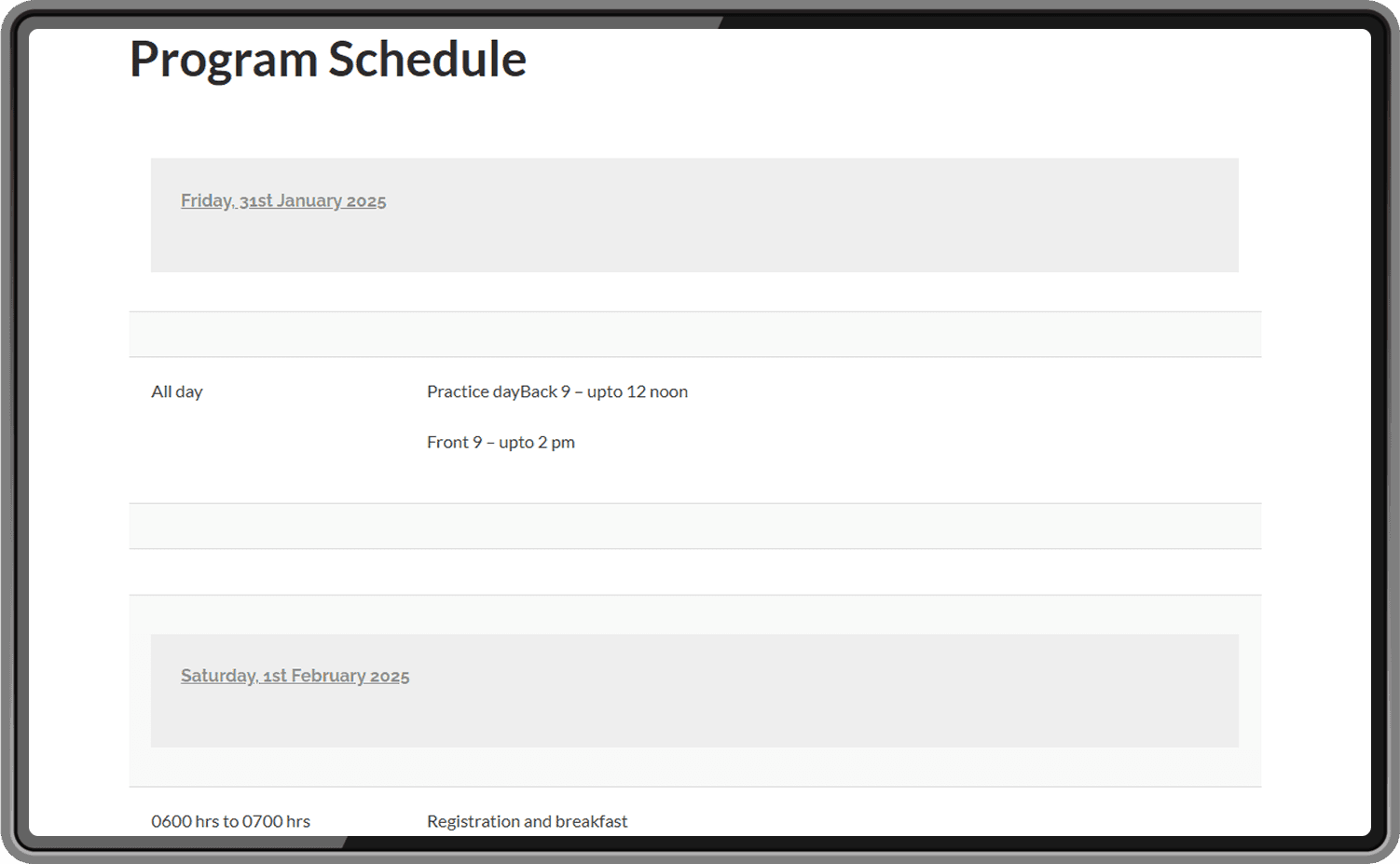
Tournament schedule page
Large empty spaces due to inefficient layout and text formatting
Navigation bar scrolls away instead of staying fixed — poor for wayfinding
No visual hierarchy to separate details making the content hard to scan

Tournament details page
Poor use of color: red highlights non-critical text, creating the wrong emphasis
Content is overly dense and text-heavy, reducing visual clarity and engagement
Fee structure could be made more skimmable via tables or visual tags

Enrollment page
Entry process is cumbersome- users must download a Word document, transfer fees manually, and email everything back
Steps are fragmented, forcing users to mentally stitch together the process
No confirmation or feedback mechanism, reducing trust and increasing uncertainty
Problem statement
"How might we redesign the UAGA website to improve clarity, streamline navigation and registration?"
UX Research
Heuristic Evaluation
Before diving into user research or redesigns, I conducted a thorough heuristic evaluation of the existing UAGA website using Nielsen’s 10 Usability Heuristics. Each page was reviewed systematically to identify violations in usability practices.
Key Findings:
Lack of feedback and page clarity (Heuristic #1 – Visibility of System Status)
Confusing navigation; the homepage looked like a tournament page.Poor structure and terminology (Heuristic #2 – Match Between System and Real World)
Golf-specific language was missing or unclear; navigation felt mislabeled.No easy escape or redo (Heuristic #3 – User Control and Freedom)
No clear way to go back from forms or deep links.Inconsistent interaction patterns (Heuristic #4 – Consistency and Standards)
Visual styles, button states, and navigation changed across pages.Manual and error-prone workflows (Heuristic #5 – Error Prevention)
The registration flow had offline forms with no error feedback or confirmation.Cognitive overload (Heuristic #6 – Recognition Rather Than Recall)
Key data like fees, formats, and rules were hidden under multiple subpages, forcing users to remember and compare across tabs.Lack of proactive support (Heuristic #10 – Help and Documentation)
No visible contact support, FAQs, or guidance when stuck.
These insights shaped early design priorities, particularly:
Clearer navigation and page hierarchy
Sticky CTAs and registration transparency
Consolidating scattered tournament info into one structured view
User Research- Survey
To better understand user needs and pain points on the existing UAGA website, a Google Form (link) based survey was conducted with 11 participants. The goal was to gather both quantitative and qualitative insights that would directly inform the redesign. Questions covered user demographics, website usability, aesthetic perceptions, and feature expectations.
Key Findings:
Primary Goals: 90%+ of users prioritize to see upcoming tournament information and its course layout details
Navigation Issues: 50%+ struggled to find information or navigate the website
Poor Visual Appeal: 83% rated the design as unappealing, calling it “dated” and “hard to use”, signaling the need for a visual overhaul
Manual Registration Frustration: Users found manual registration frustrating, and requested an automated process
“The information is there, but it’s all over the place. I just want to
register and check course details without downloading anything.”

Who are the users?
Age: 25–34 (45%), 18–24 (27%)
Golf Experience: Majority are intermediate to advanced players
Intent: Mix of fun, networking, and competition
Style Preference: Traditional, clean, professional visual tone
Personas
Based on the user research, to design an experience that truly meets the needs of the audience, 4 distinct personas were identified, each reflecting a unique user group interacting with the UAGA website

The Professional Golfer

The Aspiring Competitor

The Local Recreational Player

The Social
Hobbyist

Harimohan Singh
Professional golfer
Goals:
- Register easily
- Get structured schedules
- Prepare using course insights
Expectations:
- Detailed layout
- Reliable contact/support
Pain Points:
- Poor navigation
- Lack of updated info
- Limited networking
Traits:
- Strategic
- Disciplined
- Competitive

Aanya Malhotra
Aspiring competitor
Goals:
- Discover tournaments
- Easy registration
- Explore as a tourist
Expectations:
- Inclusive design
- Tourse layout clarity
Pain Points:
- Outdated design
- Untrustworthy process
- Missing previous game’s info
Traits:
- Social
- Competitive
- Seeks growth & connections

Aryan Mehta
Local recreational player
Goals:
- Register quickly
- Find info with minimal effort-
- Check schedules
Expectations:
- Minimalist design
- Organized layout
Pain Points:
- Info hard to find
- Redundant layout
- Text is not legible
Traits:
- Balanced player
- Prefers efficiency
- Local familiarity

Mayur Sharma
Social hobbyist
Goals:
- Stay informed about the club
- Check tournament listings
- Get previous match results
Expectations:
- Get local updates
- Find easy listings
Pain Points:
- Website lacks local flavor
- Not engaging
- Irregular to no updates
Traits:
- Social-
- Relaxed
- Values community & fun
Moderated Usability Testing
To evaluate the current UAGA website, I conducted moderated usability testing via Zoom with five participants. The primary goal was to simulate real user behavior and uncover friction points in navigating and interacting with the current site.
The test focused on evaluating how easily users could:
Find and complete the tournament registration process
Locate course layout and practice session information
Navigate the website confidently without feeling lost
Access the information they needed efficiently and without confusion
Each participant was guided through a series of predefined tasks while being encouraged to think aloud. All usability issues were noted and later rated using Nielsen’s 0–4 severity scale to prioritize design improvements.
The participants included a range of user types:
A 28-year-old professional golfer from New Delhi
A 20-year-old student and aspiring golfer from Delhi
A 40-year-old corporate employee and local member from Duliajan
A 33-year-old corporate employee and member from Duliajan
A 33-year-old freelancer and new player from Guwahati
Scenarios and tasks
Scenario 1
Registering for a tournament
Task 1: Locate the tournament registration page on the UAGA website.
Task 2: Download the form.
Task 3: Fill up the form.
Task 4: Confirm your entry into the tournament (you need not make the payment)
Scenario 2
Finding Course Layout and Practice Area Information
Task 1: Locate the page that gives you information about the practice guidelines
Task 2: Find the designated practice area for the course.
Task 3: Identify the available practice times for that location.
Scenario 3
Finding the Next Upcoming Tournament
Task 1: Locate the section where the next upcoming tournament is being listed.
Task 2: Identify the dates of the tournament.
Task 3: Check if you are eligible to take part in the tournament
Task 4: Check the entry fees
Results Summary
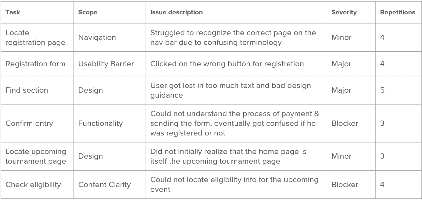
Each of the 5 participants were given the 11 tasks across 3 scenarios. The issues they faced were ranked from on a scale of 0 to 4 depending on their level of severity.


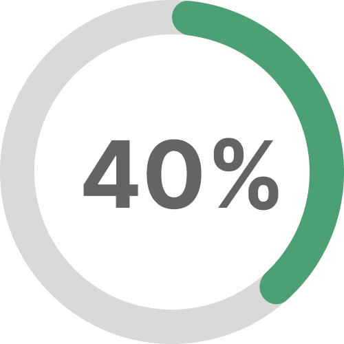
Overall task completion rate

Total issues found
The table below highlights summarizes some of the common high-frequency and high-impact usability breakdowns, helping identify systemic design flaws across navigation, content clarity, and functional affordances. These pain points informed key areas for design intervention and refinement.
User Expectations vs Experience
Pre Test highlights

Participants had never used the website before
Participants expected to see course layout information
Participants had never used similar golf website before

Participants expected to find registration and schedule information
Post Test highlights
Participants disliked the current design layout and theme

Participants were confused during registration
Participants faced frustration due to unclear content layout
Participants were confused by the homepage being the upcoming tournament section
Recommendations Overview
What needs improvement
Redesign visual language for overall appeal
Rework navigation and site structure to reduce confusion and improve task efficiency
Clarify and focus the homepage to orient users upon arrival
Simplify the registration flow to reduce friction and eliminate manual processes
What needs to be added
Add a dedicated upcoming tournaments page to support discoverability and planning
Create structured tournament detail pages that consolidate relevant information in one place
Design a course layout & practice info page for professional and competitive users
Information Architecture and Sitemap
The earlier structure of the website lacked depth, hierarchy, and clear information flow. The homepage didn’t function as an anchor and users had to constantly rely on the top navigation bar to hop between pages. This not only broke continuity but also left users confused, as 100% of participants in the usability test had to switch between multiple pages to complete one task, often expressing frustration over the fragmented layout

Old sitemap
I redesigned the information architecture to address these gaps and improve content discoverability. Key changes included:
Reorganizing pages by hierarchy, starting with a purposeful homepage
Clustering related content, such as grouping all tournament-related pages under a single parent
Adding breadcrumb navigation for better wayfinding and user orientation

New sitemap
The new sitemap introduces a layered, intuitive flow that reduces cognitive load and allows users to find all relevant tournament information in one place. This restructured approach is designed to enhance clarity, support user mental models, and improve navigation efficiency.
Functional Wireframes
Since the structure and content requirements were already well-defined through research and testing, I moved directly into medium-fidelity wireframes. These layouts focus on information hierarchy, interaction patterns, and page flow. The goal was to validate functionality, content placement, and user journeys before applying visual design.

The Design System
Since there was no existing design system in place, the website lacked visual consistency and structure. I built a new design system from scratch to bring alignment across typography, spacing, colors, and components. The primary and secondary color palette was defined in consultation with the client and derived from the existing logo to maintain brand recognition. This system ensured a cohesive look and feel across pages, simplified handoff, and set the foundation for scalable, future-ready design.

High Fidelity Screens
The website was redesigned using a new visual language to enhance clarity, hierarchy and ensuring consistency across all elements. In the usability study, 100% of users described the old design as “very unappealing” and “plain,” with confusion caused by inconsistent styling of links and buttons. The goal of the redesign was to make a strong first impression, build trust, and reduce visual and functional friction.
Home page
The redesigned Home page was created to immediately orient users and clarify that they’re on UAGA’s main landing page- not a tournament detail screen.
A strong hero section highlights the next major event with quick Register/View Details actions, while Upcoming Tournaments, Announcements, and Leaderboard previews surface key info upfront, reducing search effort and supporting faster, more confident navigation.

Tournament Listing Page
Previously, users were limited to viewing just one upcoming tournament, which caused frustration and uncertainty around future events. The new listing page shows all upcoming tournaments at a glance, with each card summarizing the basic details based on research of what users immediately looked for. Users can register directly from this page, increasing efficiency.
A sticky FAQ section was added to answer common queries, building trust and reducing abandonment. This approach supports repeat engagement and long-term participation planning.

Tournament Details Page
In the old design, essential tournament information, such as fees, eligibility, and rules, were scattered across multiple pages, making the experience confusing and time-consuming. The redesigned detail page consolidates all relevant information for a single tournament in one place. This restructuring supports faster decision-making and ensures users never have to search multiple pages for related content.

Tournament Details Page
The new registration process replaces the manual, error-prone method with a streamlined, step-by-step online flow. Users begin by filling out a form with categorized dropdowns and text fields, followed by a review screen to confirm their entries. A clear visual progress indicator shows all steps: Enter Info → Confirm Details → Payment & Confirmation. The final screen, after payment through the partnered external gateway, confirms submission and sends a confirmation email. Previously, the need to download, fill, pay separately, and email forms created distrust and dropout. The new system enhances confidence and usability by providing real-time feedback and clear status indicators.

Course Layout and Practice Information Page
A new page was created to present detailed course information that was previously hidden or difficult to find. It features clickable hole-by-hole walkthrough with all the details and description. A dedicated section outlines practice areas, schedules, and rules in a tabular format for easy scanning. This was directly shaped by user research: 60% of professional users requested course layout visibility, and 80% had difficulty finding practice session details. The new design addresses both needs clearly and accessibly.

Potential Impact
The redesigned structure and improved usability of the UAGA website aim to reduce user confusion, improve registration rates, and boost overall engagement—particularly for first-time and amateur participants. With clearer information architecture, a more intuitive tournament flow, and a modern visual language, the site is positioned to earn trust and serve users more effectively at every step.
Key Learnings
Working solo on this project allowed me to own every aspect, from heuristic evaluation to wireframing and usability testing. One major learning was the power of aligning content with user mental models, especially when working with information heavy websites. I also realized how early visual clarity, consistent feedback, and user trust cues can shape task success. Real user feedback was central to each design decision.
What I'd Do Differently
Start with a card sort test to validate navigation categories from the beginning.
Conduct comparative usability tests with other golf association websites to benchmark expectations.
Integrate more market and competitor research early on to better inform visual design and interaction patterns.
Future Scope
Add a user dashboard to manage entries and payments
Implement accessibility upgrades in typography, contrast, and interactions
Create admin tools for managing FAQs, announcements, and event content
Final Note
This project reflects the beginning of a scalable, user-first digital ecosystem for UAGA. The foundation built here ensures that future enhancements can evolve smoothly and stay aligned with both user needs and organizational goals.