


Role
UI Design
Interaction Design
Tools
Figma
Photoshop
Illustrator
Timeline
1 week
What is OneCard?
OneCard is a premium, app-based credit card solution designed for the tech-savvy generation in India. It combines simplicity with innovation, offering users complete control over their credit card transactions, statements, and rewards—all in one place.
As a designer, my task was to reimagine parts of this experience by crafting a high-fidelity mobile UI that would uphold the brand’s premium essence while keeping it intuitive for users.
Key Highlights
Client Brief
Design a UI that feels luxurious while reflecting professionalism and trust.
Primary Objective
Create a modern dark-themed interface tailored for a financial audience.
Key Challenges
Integrating premium aesthetics that can cater to all user demographics
The Starting Point: Wireframes
The project began with a set of wireframes provided by the client, outlining the app's core structure and functionalities. While the foundation was clear, it needed a polished visual identity that would elevate the user experience to align with the OneCard brand.

Design Decisions: Bridging Functionality & Luxury
Every design decision made was a deliberate attempt to align with OneCard’s premium persona:
Color Psychology:
Blue instills trust. Being a finance-based app, this was the most important aspect to consider
Dark themes are often associated with sleek, modern, and professional designs, appealing to users who prefer a premium or tech-forward aesthetic. It aligns with OneCard brand's luxurious identity.
Typography Harmony:
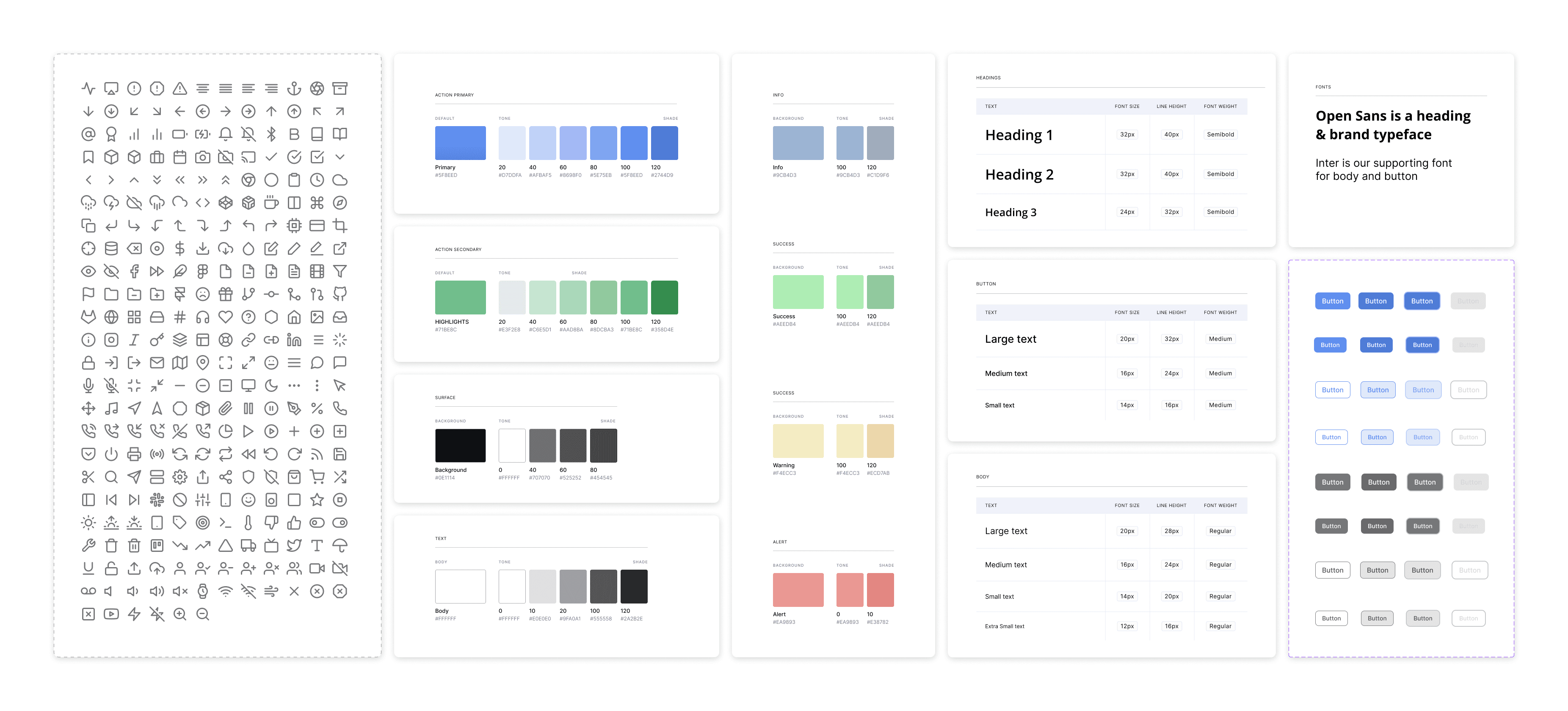
Open Sans was chosen for headers to complement the brand typeface.
Inter, with its clean and geometric structure, was used for body text to ensure exceptional legibility across digital screens, especially on a dark background.
Accessibility First:
High contrast ratios between text and background were maintained to ensure readability, especially for the dark theme.
Care was taken to design for inclusivity, using colors, typography, and navigation patterns that meet WCAG (Web Content Accessibility Guidelines) standards, ensuring an effortless experience for all users.
Style Guide & Design System
To ensure consistency across the app, I established a comprehensive design system that reflects the luxurious tone of OneCard while maintaining usability.
The Solution- High Fidelity Prototypes
Building on low fidelities, client requirements, design decisions and style guide, I developed high-fidelity designs which focused on delivering a seamless and intuitive experience.

Challenges and iterations
Designing for luxury comes with its challenges. Balancing opulence with functionality required multiple iterations:
Challenge: The heavy reliance on blue accents made it difficult to create visual distinction between interactive elements..
Solution: I retained the signature blue for primary action buttons for a modern touch. Secondary buttons were styled in muted blues or soft purples to maintain distinction without overpowering.
Challenge: Maintaining accessibility in a dark theme.
Solution: I had to continuously keep testing contrast ratios rigorously, ensuring all text and icons met WCAG AA standards.
Impact and Conclusion
The redesigned OneCard UI encapsulates the brand’s luxurious identity while enhancing the user experience. Key outcomes include:
A visually cohesive interface that builds trust and sophistication.
Improved usability through clear visual hierarchy and minimalist layouts.
Positive feedback from early design reviews, emphasizing the premium feel of the app.