
Role
User Research
Product Strategy
UI Design
Interaction Design
Tools
Figjam
Notion
Figma
Dovetail
Timeline
5 weeks
The Problem
Sofar Sounds' business is dedicated to curating intimate concerts in unique spaces. Their platform acts as a module for booking tickets for the audience. The problem was based around audiences searching for concerts and booking tickets.
Business problem- The main problem for the business was lack of bookings. Most users were not going past the homepage resulting in non-completion of tasks.
User problem- The landing page was confusing for users and they had no clue where to search for a concert. The search pages also lacked filters, hampering the search experience
The Solution
Both the user and business problem could be addresed with the same solution. This solution was developed with the below 2 steps -
Refined landing page, with primary focus on the search bar for making the initial steps of searching quick and easy.
Added new filters and sorting options on the search page to make the process quicker and easier.
The success of the solution would then be measured by the increase in bookings.

Usability Review
The usability audit was conducted using the concept of 'Wow and Pain moments' to review the product. We analyzed the product from the perspective of both a user and a designer.
A summary of the findings are-
Multiple friction points (displayed in the infographic below in red tabs), the primary one being lack of a dedicated search bar or search text field to start of the process.
There's no dedicated colour palette. Some sections have really high contrast where it gets difficult to focus on the required elements.
Call to actions are either missing or they are not visible at a glance.
Lack of adequate filters to refine the search results.
The audit laid the foundation for the next steps, detailed the areas that needed improvement and identified missing features that could be added.

Competitor Benchmarking
The competitor benchmarking was conducted to understand the market standard. Few insights of the competitor benchmarking are-
It gave an idea of the competitor's workflow, and their product's USPs and offerings that stood them out from the competition.
We also identified friction points that would be avoided in our design, as well as useful elements that we could include.
Certain gaps were identified which when filled, might give our product an advantage.
The concept of LEMES that was used for the process of benchmarking would also help us scrutinize our product and assess its performance.

Problem Space
For a well founded research and design, it was necessary to identify a problem space for which the following questions needed to be answered-
What is the problem?
Who is affected by the problem?
Where does the problem occur?
When does the problem occur?
Why does the problem occur?
Why is the problem important?
Answering these issues, a problem statement was formed around which the next steps would be initiated-
"How might we enhance the search functionality for users?"
UX Research

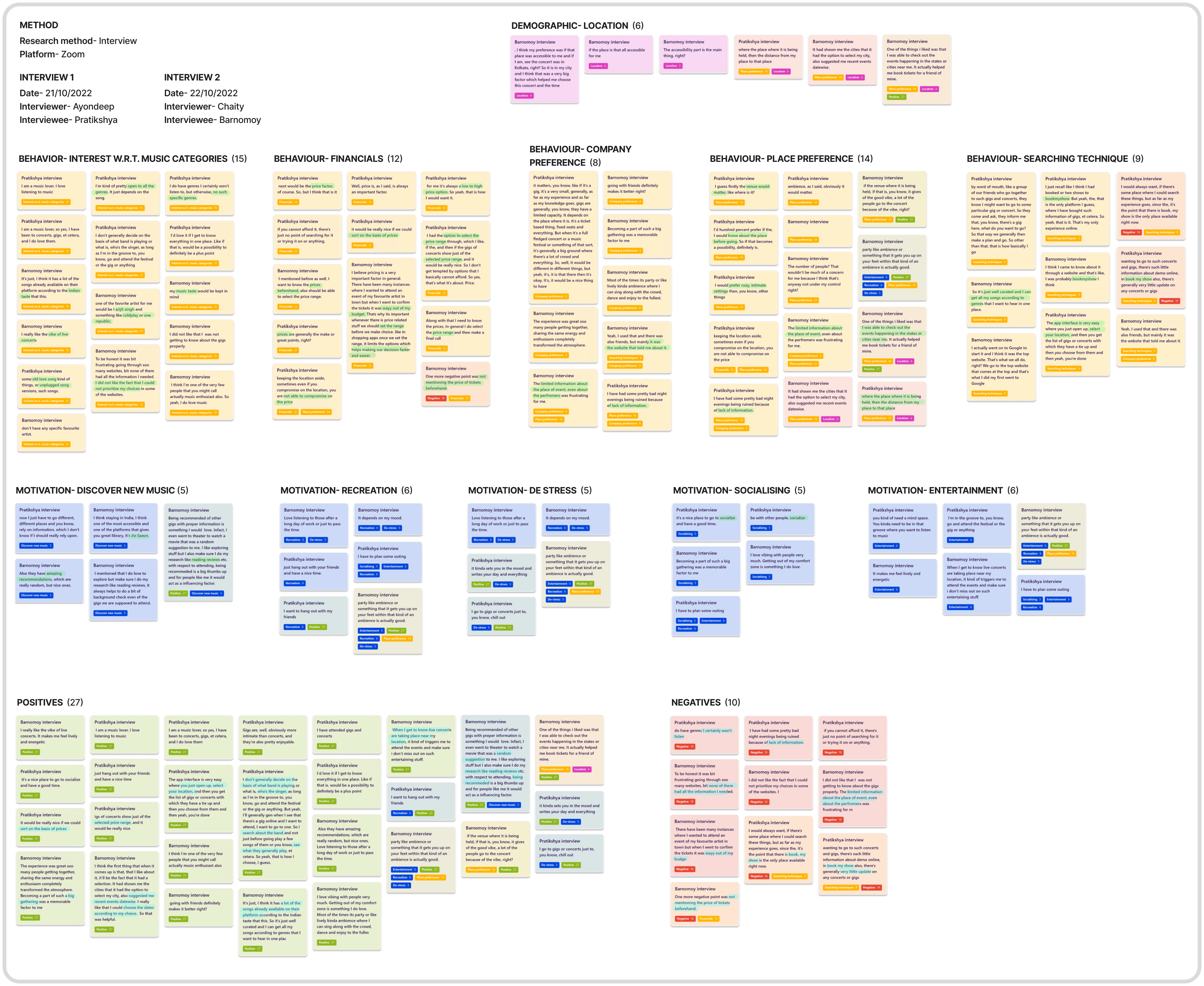
Data synthesis- Tagging taxonomy
To interpret the data from the interviews, the concept of tagging taxonomy was used where we created groups of tags to organize the data and understand the trends within them to gain actionable insights.
For this research interview, the various tags were divided under four main categories- method, demographics, behavior and motivation.
Finally, all the data was then interpreted based on the positives and negatives to gain clarity easily.

Data synthesis- Affinity map
With the interviews done and its transcripts ready, the data was categorized into nuggets using the tags made during the tagging taxonomy. This created the affinity map in Dovetail which helped interpret the data.
Insights of the research
The affinity map helped understand trends which then leads us to gain actionable insights of the research that is being conducted.
For this research, we could identify six major insights which would help in the design process and act as the backbone during decision making.

Information architecture
The information architecture of the current Sofar pages were mapped out to gain a better understanding of how we could improve the hierarchy of information and help users adapt and navigate efficiently. We mapped this on a page, section, component and sub component (icons and vectors) level.

Ideation
With the insights gathered and the information architecture mapped out, the next step was to brainstorm and ideate around the problem statement to make a better and more efficient product.
After completing the mind map, the results were categorized into into must-have, nice to have and not needed. The must-have and nice to have options were further scrutinzed in a priority matrix of effort versus impact.

What can we add
Adding new filters and sorting options to enhance the searching process and making concerts easy to find.
What can we improve
Improving the visuals and trying to attract attention on what's mostly required for a more efficient process.
User Flows
The user flows mapped here shows the journey from landing on the home page, searching for concerts and finally selecting one and proceeding to the payment gateway.

Summary of the existing user flow-
The user flow starts with 2 options which lead to the same path, making it confusing.
It has unnecessary extra clicks like 'load more', which could be avoided.
It has 7 preset filters which are totally unrelated and could be improved.
The current user flow does not have an option to go back. It can be done using the browser buttons or there's an option to see more events, but doing this refreshes all the previously set filters and users have to apply them again.

Summary of the improved user flow-
The flow starts with setting locations and search date- which can be changed anytime as that search bar remains constant throughout all pages.
Filters remain independent and can be changed anytime.
In case users go back to the search page, previously set filters do not change.
Rapid Prototyping
The low-fidelity prototypes were designed based upon the previously set benchmarks, insights gathered from the research, the information architecture framework and following the improved user flow. It also includes the improvements and additions finalized after the ideation process.
These reflect what the updated product would look like.

Styles & Components
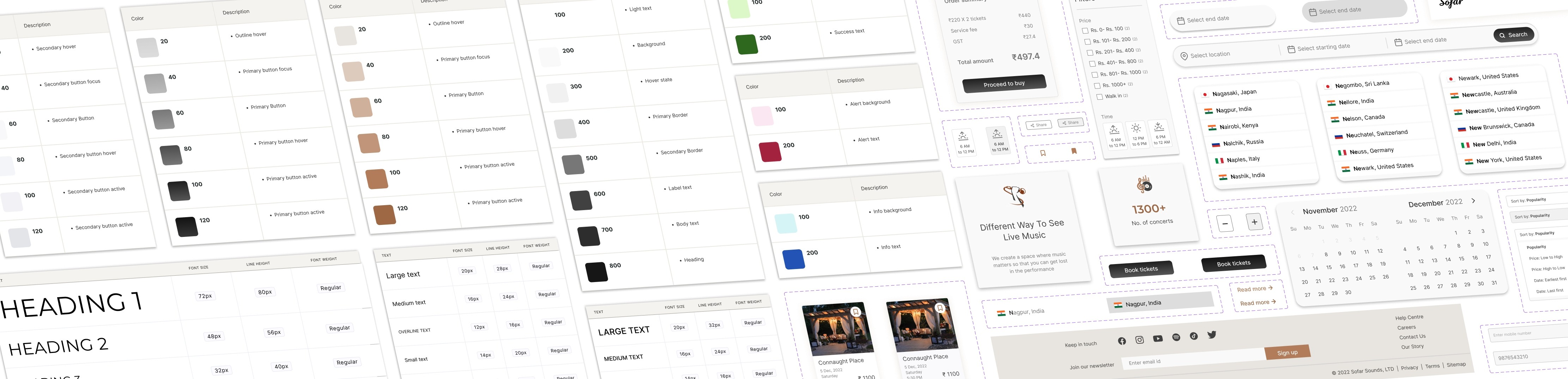
The UI design system for the high fidelity prototype included the required colour styles and shades along with a detailed typeface and shadows. It also includes the various types of buttons in all its states and the other UI components and their interactive states.
High fidelity prototype
This high fidelity prototype is the final iteration of the product. It builds up on the low-fidelity framework while following the UI styles and guidelines. The final outcome is an attempt at solving the problem statement and enhancing the business profits.
Home page

A new search bar was introduced to start off the process of searching. It remains constant throughout different pages. Rest of the page was slightly redesigned with the same content.
Home page- Selecting location

Selected tab on search bar is highlighted to maintain hierarchy and clarity. Flags were also added to the location drop down menu to attract attention quickly.
Home page- Selecting search date range

For selecting the search date range, the calendar drop down menu shows the current and next month- reducing one click (if required).
Search page

The search page has been redesigned and includes filters for price and time of event, which have been introduced based on the research. An option to sort the results has also been added to make the searching process easier.
Event information page

The event information page highlights the general details of the event while focusing more on the band and venue details, which have been retained from the previous Sofar pages.
Order summary page

The order summary pages focuses on the total price based on the number of tickets. Only addition here is the section for contact information where booking details would be sent.
The following video shows the final version of the product with all the interactions-
Key learnings
I was able to understand different concepts of a UX research and how its in depth analysis helps build up a well founded design.
For a designer, working out a search functionality generally has many open ended results when we cater to a wide variety of users. It was a great opportunity to learn how I could tailor this experience according to different opinions, while making the process efficient for everyone.
It was important to understand the value of providing similar and simplified elements to new users and not go over and beyond to improve the learnability, memorability and efficiency of the overall application.
What could I have done better?
Due to time constraints, only 2 research interviews were conducted. If I had more time, I would've conducted more interviews to gather additional data, hence building a better foundation for the design process.
With the time and users available, it would be fruitful to conduct a moderated usability test to assess the performance of the product.
I could've researched and designed better if I had more awareness of the business methodology and its direction.