
Role
Product Audit
Product Strategy
UI Design
Interaction Design
Usability Testing
Tools
Figjam
Notion
Maze
Figma
Photoshop
Timeline
5 weeks
The Problem
The problem was identified and divided into 2 categories-
Business problem- Lack of footfall on the Cold Shower Challenge of the Wim Hof app and non-completion of tasks
User problem- Confusing layout on screens without proper hierarchy and uniformity. Certain areas lacked logical sequencing and guided directions within the product, resulting in users getting lost.
The Solution
Reaching the user and business goal was a step by step process-
Enhancing the user experience and making it easier for users to complete the required tasks
Learning from the competition and making a USP for our product that will make it stand out in the market
A reward system to spread the word that'll eventually lead to higher footfall

Usability Review
A usability audit, based on the concept of 'Wow and Pain moments', was carried out to review the product.
A summary of the findings are below-
Multiple visual and logical friction points hampering the user experience
Lack of hierarchy, contrast and a consistent colour scheme
Insufficient visual descriptions in elements like buttons and cards
Lack of a clear positive approach to show an achievement or decline a request
The usability test allowed us to empathize with and understand a user's experience on the product. We used this to build a more fluid design, focused on an enhanced experience.

Business & User frustrations
The product lacks on adequate hierarchy and emphasis form the get go. Confusing instructional design elements for CTAs and buttons compound the problem, leading to non-completion of tasks.
The end result is users pulling out of the product which is the major point of loss from the business perspective.
Primary Frustration
Landing on the homescreen, there's lack of hierarchy and visual guidance. This leads to users losing focus and hence, missing out on the cold shower tab.
Secondary Frustration
There is no motivation, mention of benefits or incentives for a user to start a cold shower challenge or even continue it, if started. This absence of promotion limits users' footfall.
Competitor Benchmarking
Benchmarking was conducted for two types of competitors- direct and indirect. This process provided a baseline of market standard to be followed, and also gave insights into key features for the re-design.
A summary of the findings are below-
Understood the USPs of the competitors, their user flows and ways of making the product efficient and easy to use.
Figured out friction points in products which have to be avoided while designing and vice versa for the satisfying moments.
Identified gaps in the market and figuring ways to fill up that void.
The concept of LEMES that was used for benchmarking would also help us scrutinize our own product against the competitors and assess its performance.
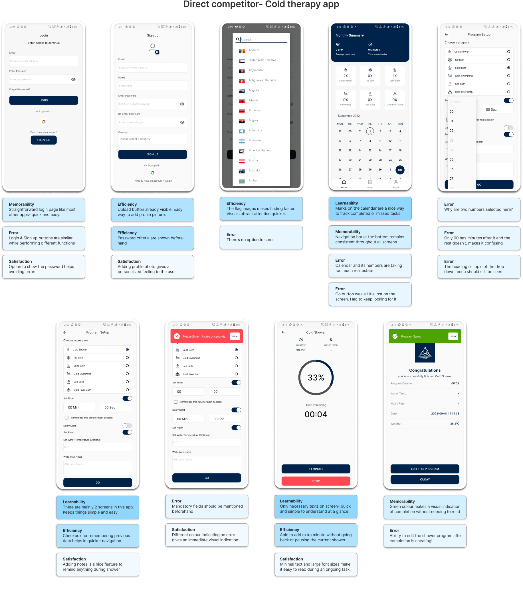

Problem Space
To make the foundation for a well founded ideation phase, the problem space was identified with help of the following questions-
What is the problem?
Who is affected by the problem?
Where does the problem occur?
When does the problem occur?
Why does the problem occur?
Why is the problem important?
Answering these issues, a question was formed around which the ideation process would be initiated-
"How might we enhance the product for users to complete the Cold Shower Challenge in the Wim Hof application?"
Ideation
After defining the problem space, the process of ideation was initiated, diverging into finding new angles and creating as many ideas as possible to build the best possible version.
The ideation phase included the following techniques-
Crazy 8
Brainstorming
Mind mapping
The results were further scrutinized using a priority matrix of effort versus impact.

What can we add
What can we improve
User Flows
The user flow mapped here defines the path from opening the app to completing the cold shower challenge.
The existing user flow had a short but complex system without options of turning back at multiple points. Certain changes also reset the entire process to initial stages.
The improved user flow was formulated by following a functional approach for recurring users with inclusion of the new ideas. Steps to set up the shower were kept independent of each other.


Rapid Prototyping
The low-fidelity prototypes were designed considering all the previously set benchmarks, new ideas, improvements and follows the refined user flow. This framework reflects what the updated product would look like.
After the homescreen, the updated shower challenge works in a 3-step process- setting up, countdown and showering period.

Styles & Components
The visual language for the product was finalized by defining a style guide and ergonomics system for the UI components-
Primary/CTA colour: purple-blue gradient (and its shades to showcase states)
Surface/background: dark themed shades of grey
Text colour: shades of white, in contrast to the dark theme
Typeface: 'Inter' with dedicated heading and body sizes
4 column grid system
The UI components (buttons, cards, icons, checkboxes, navigation bars, text fields etc.) and their states were formed in accordance to the UI style guide and desired design requirements.

High Fidelity Prototype
This high-fidelity prototype is the final iteration of the product. It follows up on the low-fidelity framework and inculcates the UI styles and guidelines; looking to provide an enhanced user experience and hoping for greater business gains.

The following video shows the final version of the product with all the interactions-
Usability Testing
After completing the high-fidelity designs, it was finally time to assess the performance of our product. An unmoderated usability test was conducted with a usability script based on 3 steps for multiple tasks-
Background or scenario for the task
Completing the task
Wrap up question for each task


Test outcomes
Having tested the prototype, I concluded that the product should be more comprehensible in its objective with visually reduced cluster. This should keep the user focused on the objective and aid in completing the tasks easily.
Three key learnings
Being able to stand on the user's shoes and understand the psychology from their perspective.
Ability to define, understand and solve a problem to improve a product accordingly.
Reviewing a product and working with design concepts of hierarchy, visual guidance and focal points.
Next steps
Having more time to iterate, the next step would be to inculcate the feedback from the test to improve the design and its performance.
It might help to try and keep the user more focused on the goal to reduce the time one might need for completing a task. Possible steps for achieving this could be-
Reducing elements and decreasing clutter, hence avoiding misclicks while also increasing focus.
Avoiding too many options to modify tasks.
Working on simpler images or logos that directly indicate the objective.